Thursday, 15 December 2011

AWoodlands Primary School Sculpture Project : Part 2 – Fabrication

With the concept design well under way the next task was to start work on the fabrication. By starting work on the frames and blank panels I could continue to develop the designs while working on the fabrication.

In making the frames accurate technical drawings were essential  since they would need to be a good fit with the panels themselves. The frames themselves were made from hot rolled steel angle section with corner plates which would both stiffen the frame and provide convenient mounting points for anchor bolts into the walls.

The first job was to cut the parts for the frames, those for the smaller panels were made from 40x40x3mm steel angle, with 50x50x4mm steel angle for the frame for the large panel. All the individual parts were cut to length and mitred using a bench mounted circular saw.


A set of cut parts

All the parts for one frame together


Cleaning up the corner plates with a grinder

Frame and panel clamped together for drilling
One of the smaller panels welded together


Detail of one of the corners tack welded in place, tack welding fixes the pieces together securely putting the minimum amount of heat into the work. This allows the pieces to be positioned accurately and reduces the risk of distortion when the final welds are put in place.


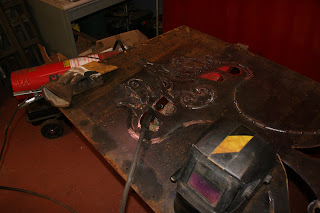
The pattern for the large tree panel was traced onto a full sized steel panel using an enlargement projector. It was then cut out of the panel using a freehand plasma cutter. The main body of the tree design was then welded back onto the sheet to form a relief. The face side was TIG welded to create the neatest possible weld seam all the way around the outline of the tree.


The smaller panels were made in a similar way. Some used stencils created by enlarging drawings with a projector, others were drawn directly onto the steel plate, working from reference images.


The centerpiece of the installation is the large 1m x 2m panel depicting a stylised tree in relief. This piece was by far the most technical demanding of the series and required a carefully planned sequence of cuts and welds to create the graceful outward arc of the trunk. 

Thursday, 1 December 2011

Woodlands Primary School Sculpture Project : Part 1 - Concept

In May of this year I was commissioned to create a sculptural installation for a brand new school building in Telford, Shropshire.

After an initial meeting with the client we decide to use the school's name of Woodlands as the central theme of the project, naturally this made native trees and plants a clear choice.

In terms of format I quickly came to the decision that a series of wall sculptures in the form of panels would be ideal. This was suggested by both the inviting large walls of the new building and the fact that the distinctive outlines of the leaves of many native tree species looked like they would work very well in silhouette.

As well as finding as many stock photographs as possible I felt it was important to really get a feel for how trees and leaves looked and felt in the flesh as it were, so I took a lot of walks, collecting specimens, taking photographs and just absorbing the forms and textures of natural woodland. This quickly lead to a whole series of sketches as I gradually refined and developed my ideas.I was looking particularly for leaf and branch shapes which had distinctive and characterful silhouettes and shapes.


With this decision made and ideas for the design and compositional elements well under way,  the next task was to consider the practical engineering implications of the content. I decide that rectangular panels with designs in relief and negative silhouette would be ideal. This approach would allow me to cut out the intricate and delicate designs that the forms of the leaves I was studying suggested while keeping a structure which was still robust, durable and, above all, safe.

Rather than simply bolt the flat panels to the walls I wanted to use a fixing method which would give a bit more depth and contrast to the wall. By spacing out the panels on steel frames I gave myself a lot more flexibility with the design and construction of the mechanical fixings without worrying about their visual impact and keeping the whole thing looking clean and refined. Spacing the panels out from the walls would also be an effective way to use shadow to emphasise the leaf shapes that I wanted to use.


 I also realised that I wanted to create a dramatic centrepiece which would really sum up the mood of the whole installation and act as a focal point for the whole project. The obvious answer was to use the image of a single tree. After playing with several ideas I ended up with something which was quite stylised but still had a really organic feel and added an extra dimension to the more naturalistic renderings of the leaves.

I eventually came up with the design below. It went through quite a long process of evolution right up to the point when I was transferring the stencil onto the steel plate ready to be cut out. One thing I was particularly keen to get right was the sense of proportion. As is was such a large panel (1m x 2m) I wanted it to have some sense of upward movement to give a feeling of growth and not end up being too squat or heavy.